A new creative identity for Chicago kombucha company La Xplorer-Kombucha. The end product was to deliver a refined, modern logo that still celebrated its ethnic and culturally rich background.


This significant emblem was designed to encompass the owner's philosophy for life. In the circular design, which is a call out for our world (Earth), a mountain can be seen within symbolizing the upward-facing journey we go along until there is breakthrough beyond the Earthly realm as seen by the smaller circle shapes rising up.
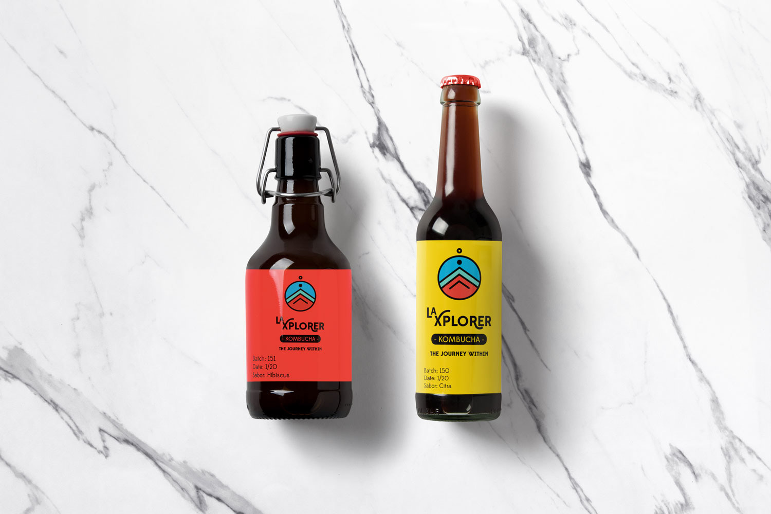


The wordmark is an original design pulling from the font Edmond Sans, a wonderfully playful and contemporary typeface.